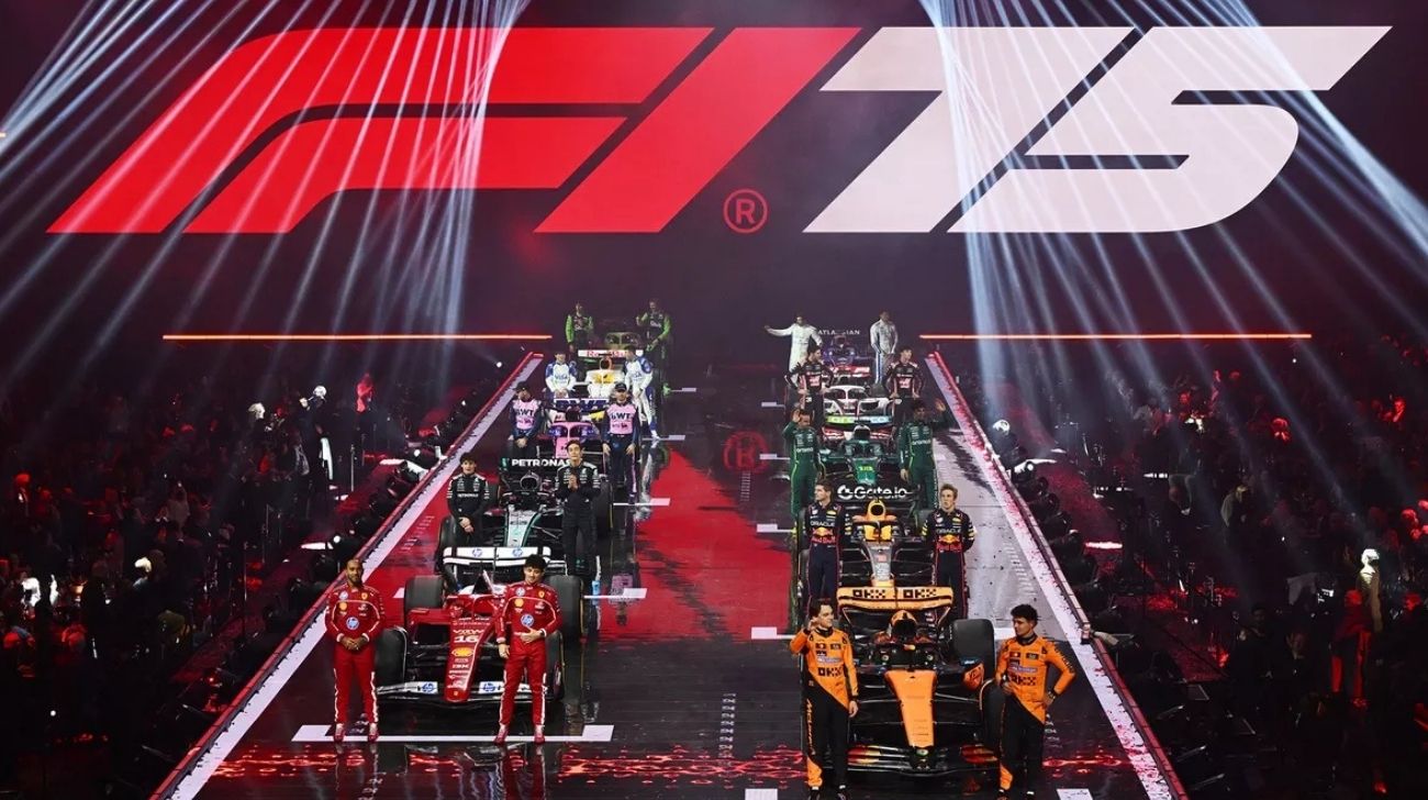
Well, there you have it, the grand unveiling of the 2025 Formula One season. And what a spectacle it was. The world’s most sophisticated, high-tech, and ruthlessly competitive racing series decided to launch its latest season with an event that was simultaneously awkward, bewildering, and ever so slightly embarrassing.
For those of you who had the good sense to avoid it, let me summarise: team principals muttered some carefully scripted nonsense, Charles Leclerc looked like he wanted the ground to swallow him whole, and Machine Gun Kelly—who, for reasons unknown, was present—performed a song that will be best remembered for featuring the line “I don’t give an F1.” Which, to be fair, seems rather apt.
But the real reason we all tuned in—aside from the morbid curiosity—was to see the 2025 grid. Some teams have played it safe, others have been slightly daring, and one or two appear to have suffered a mild concussion just before finalising their designs. Here’s my entirely subjective ranking of the liveries because, of course, that’s what matters.
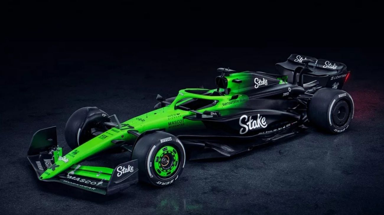
10. Sauber – 2/10
Look, I admire Sauber. They’ve been plugging away in Formula One for years and are still here. But their 2025 car looks like someone has raided the post-Halloween clearance section at a budget supermarket. The black-and-green gradient isn’t a bold design choice, as it is a last-minute PowerPoint transition. The whole thing is topped off with the Stake logo, which appears to have been designed by a child learning to use Microsoft WordArt. The good news? Audi is taking over soon.
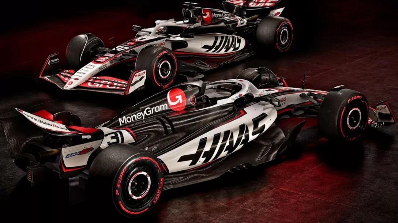
9. Haas – 4/10

America’s team! Well, sort of. It operates from Banbury, which is slightly less glamorous than Indianapolis. I suppose the black, white, and red scheme persists, which is fine, but it’s all a bit uninspired. This livery is the automotive equivalent of a lukewarm cup of tea. Perfectly functional but not exactly exciting. Say what you want about Rich Energy’s ill-fated tenure; at least the black and gold looked interesting.
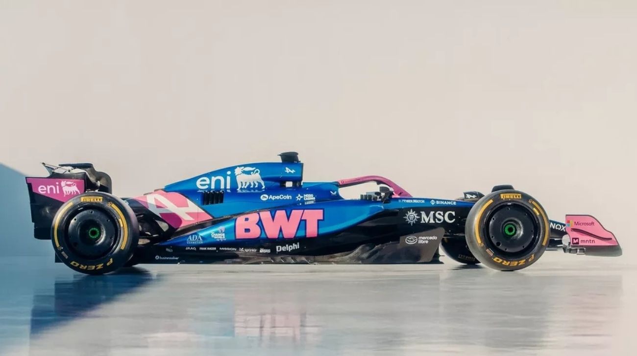
8. Alpine – 4/10

There was a time, not too long ago when Alpine produced one of the prettiest cars on the grid. That time has passed. Since BWT slapped its corporate pink all over the car, the team’s livery has looked increasingly like a confused gender reveal party. It’s bright, it’s distinctive, but it’s not exactly pretty.
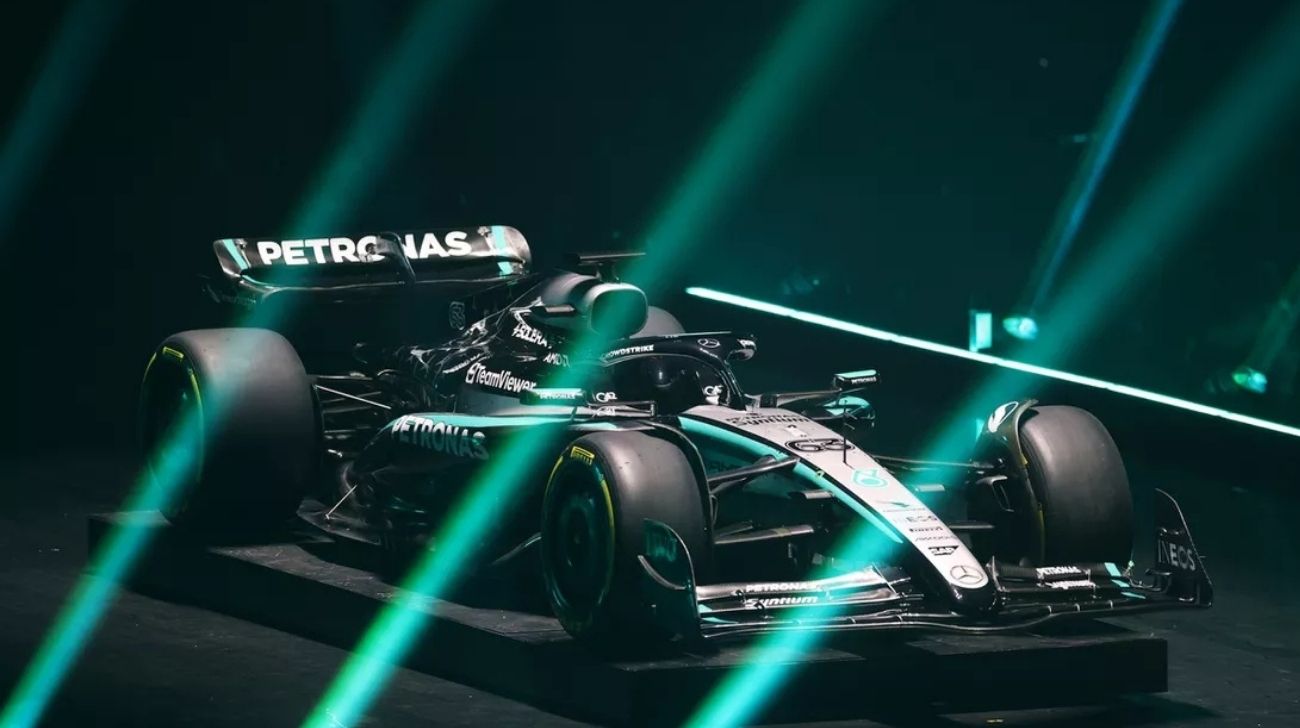
7. Mercedes – 5/10

Mercedes has decided that the best way to approach 2025 is to change almost nothing. There is, of course, the minor detail of the airbox being silver instead of red, which is sure to send shivers of excitement down the spines of livery aficionados. Beyond that, it’s business as usual. The fading three-pointed star pattern at the rear is still quite nice.
6. Williams – 5/10

Williams has a new title sponsor, Atlassian, which does… something. Presumably important. Their involvement hasn’t changed much visually, though. The team remains committed to its shade of blue, and while it is quite fetching, it’s not exactly a revolution. Nevertheless, it’s neat, tidy, and quite inoffensive. Much like Williams itself, really.
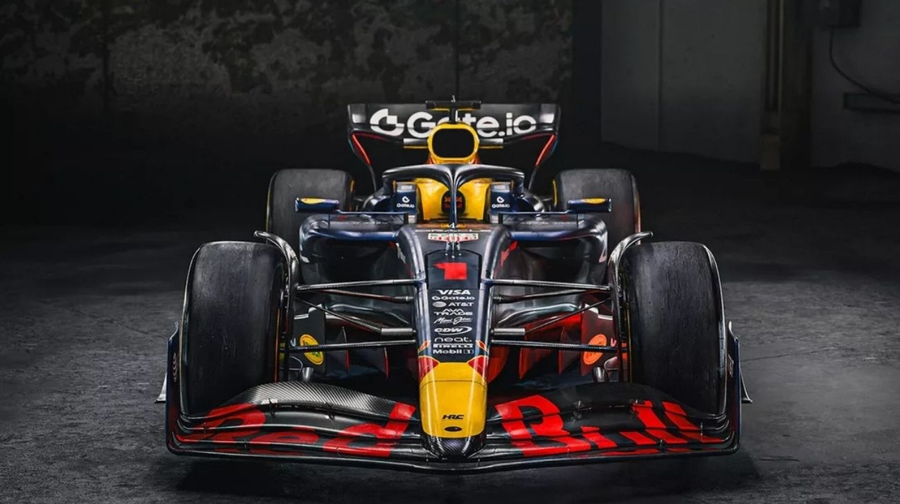
5. Red Bull – 5/10

Look, we all know Red Bull’s livery is iconic. The deep navy blue, the yellow charging bull, the occasional flashes of red—it’s all very recognisable. But they’ve been running essentially the same design for years. Indeed, at some point, they could at least mix things up a bi.? The car will, as ever, be powered by what is technically called a Honda engine but is now labelled something else, producing somewhere north of 1,000bhp and enough torque to bend time itself.
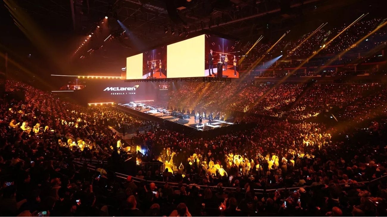
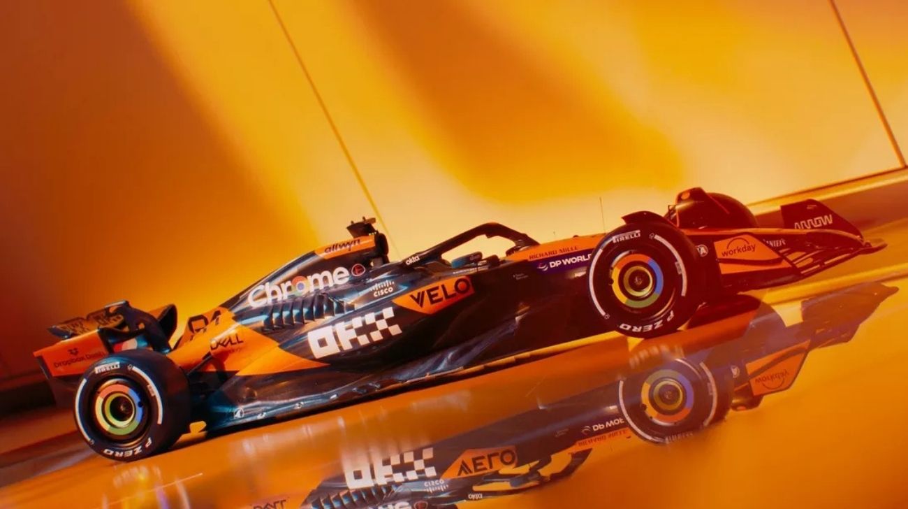
4. McLaren – 6/10

The McLaren is orange, which is good. The McLaren is still mostly orange with a bit of black, which is… fine. The McLaren is barely distinguishable from last year’s car, which is mildly disappointing. However, the bare carbon elements and flashes of blue do look quite bright. I’d still rather they went retroactively and gave us a proper Marlboro-era white-and-red livery. But, you know, smoking is terrible.
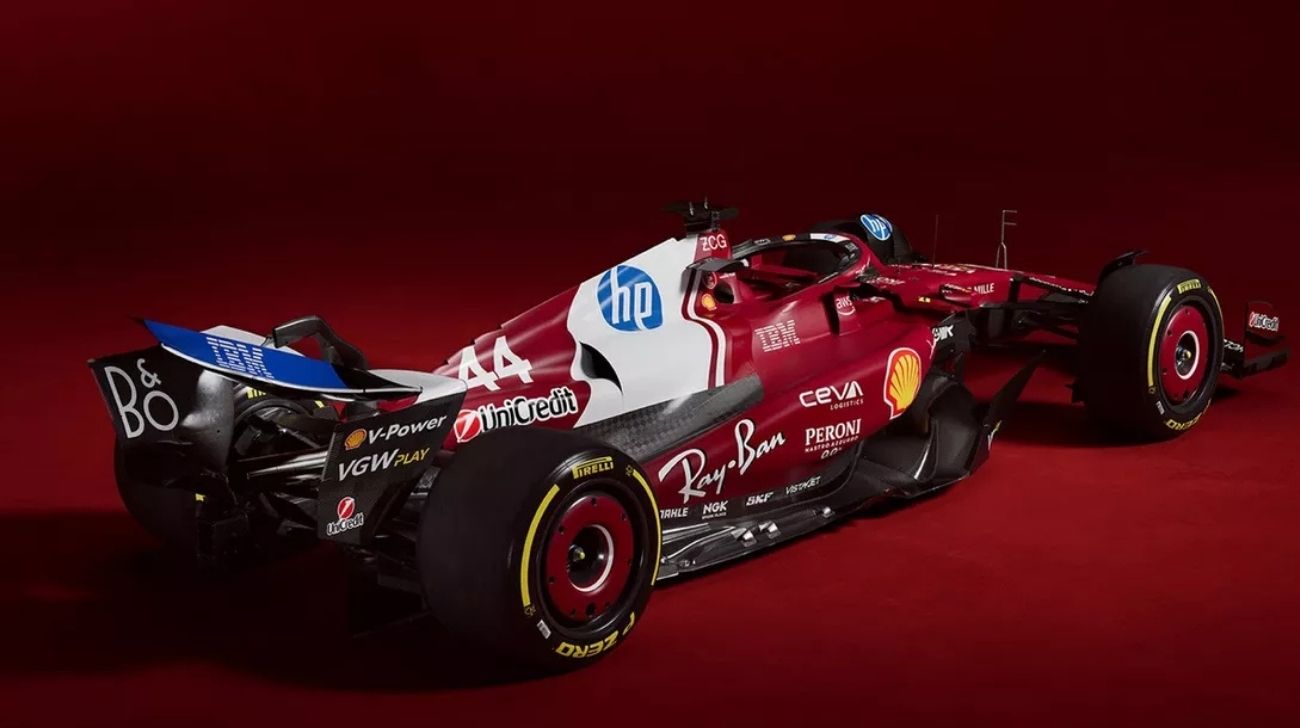
3. Ferrari – 7/10

Now, this is interesting. Yes, the Ferrari is still red because it is, but they’ve made a few tweaks. The front and rear wings are white, as is a chunky stripe down the engine cover. The result? It looks rather good. The shade of red is more profound and richer than before, reminiscent of the glorious 312T2 driven by Niki Lauda. That’s never a bad thing.
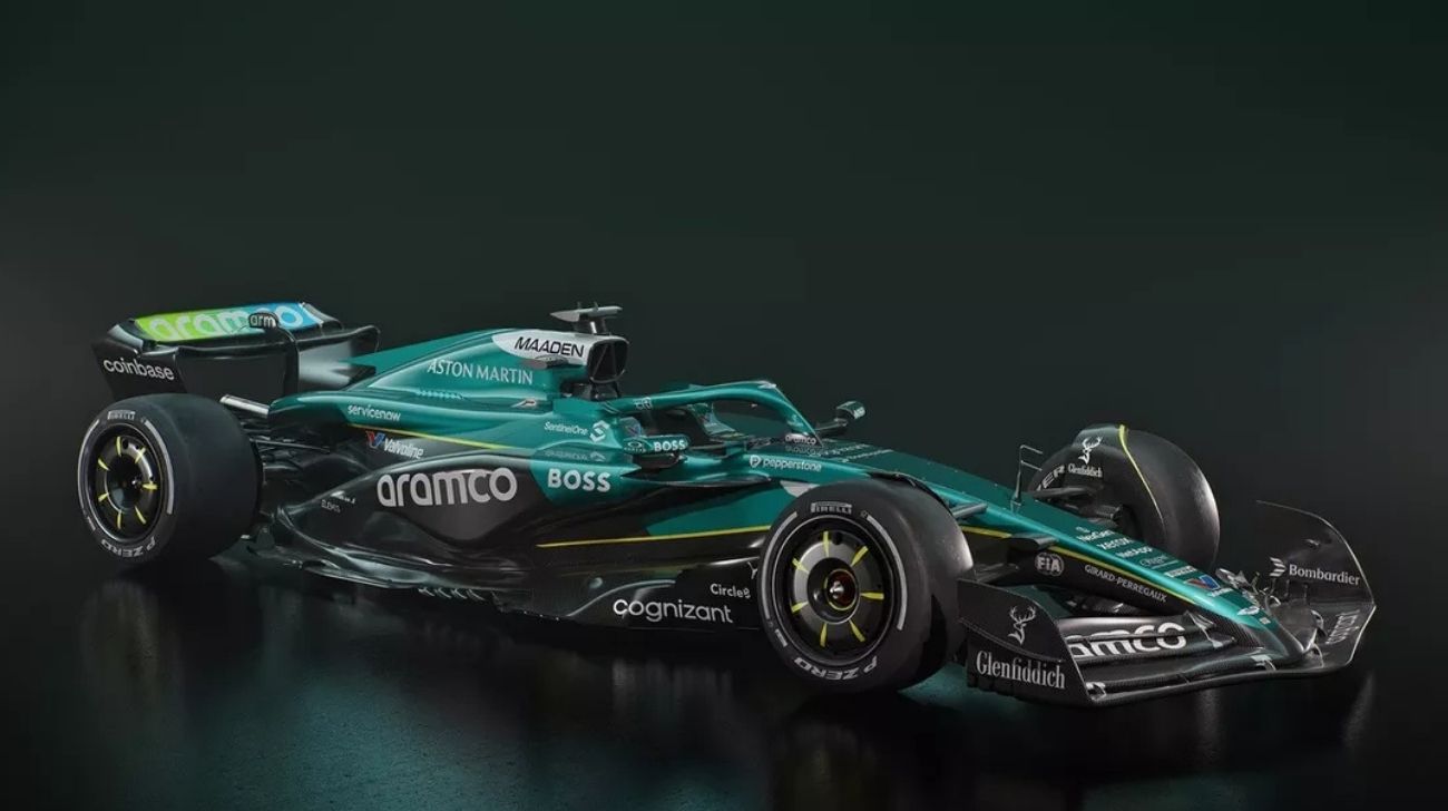
2. Aston Martin – 7/10

Aston Martin insists on shoehorning James Bond into everything it does, which is mildly irritating. However, the car itself remains a thing of beauty. The British racing green is as elegant as ever, and while it’s not remarkably different from last year’s effort, it’s still one of the best-looking cars on the grid. Sometimes, consistency isn’t a bad thing.
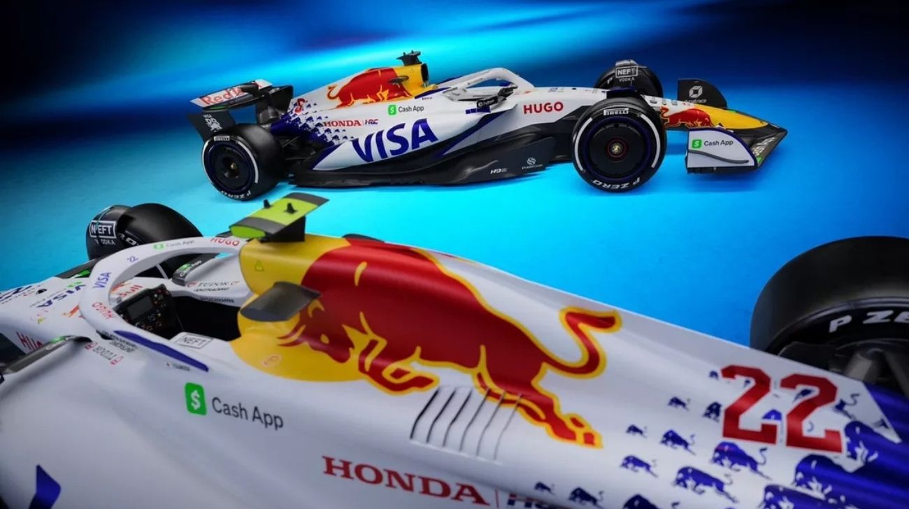
- VCARB – 8/10

And the winner is… whatever the artist, formerly AlphaTauri, calls itself this year. The Visa CashApp Minardi Toro Rosso Alpha Bulls Racing Team—or something like that—has done something different, and the results are striking. The simple white base, offset by bold reds, blues, and yellows, makes it stand out in the best way possible. It’s clean, it’s modern, and it looks fast. This is quite important when dealing with 1,000bhp V6 turbo hybrid monsters.
So there you have it—the F1 grid for 2025. Some of the cars are good, some are bad, and some will almost certainly change their design when a sponsor inevitably pulls out mid-season.